Data from a clinical trial, involving 2 treatments (control and active drug), conducted at 11 randomly selected centres are discussed by Beitler and Landis (1985). For the \(i\)-th center and \(j\)-th treatment, the proportion of \(n_{ij}\) patients having a positive response (\(y_{ij}\)) is recorded below (material extracted from Gallagher, 2023):
Centre
Treatment
\(y_{ij}\)
\(n_{ij}\)
1
drug
11
36
1
control
10
37
2
drug
16
20
2
control
22
32
3
drug
14
19
3
control
7
19
\(\ldots\)
\(\ldots\)
\(\ldots\)
\(\ldots\)
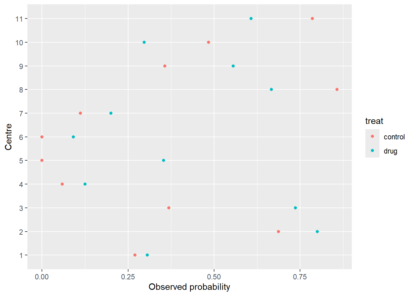
1. Load the data intored in the multicentre.txt file, convert centre variables to factor, and make a descriptive plot to visualize differences between treatments and/or centers.
  centre   treat  y  n       obs
1      1    drug 11 36 0.3055556
2      1 control 10 37 0.2702703
3      2    drug 16 20 0.8000000
4      2 control 22 32 0.6875000
5      3    drug 14 19 0.7368421
6      3 control  7 19 0.3684211
We observe systematic differences between centres.
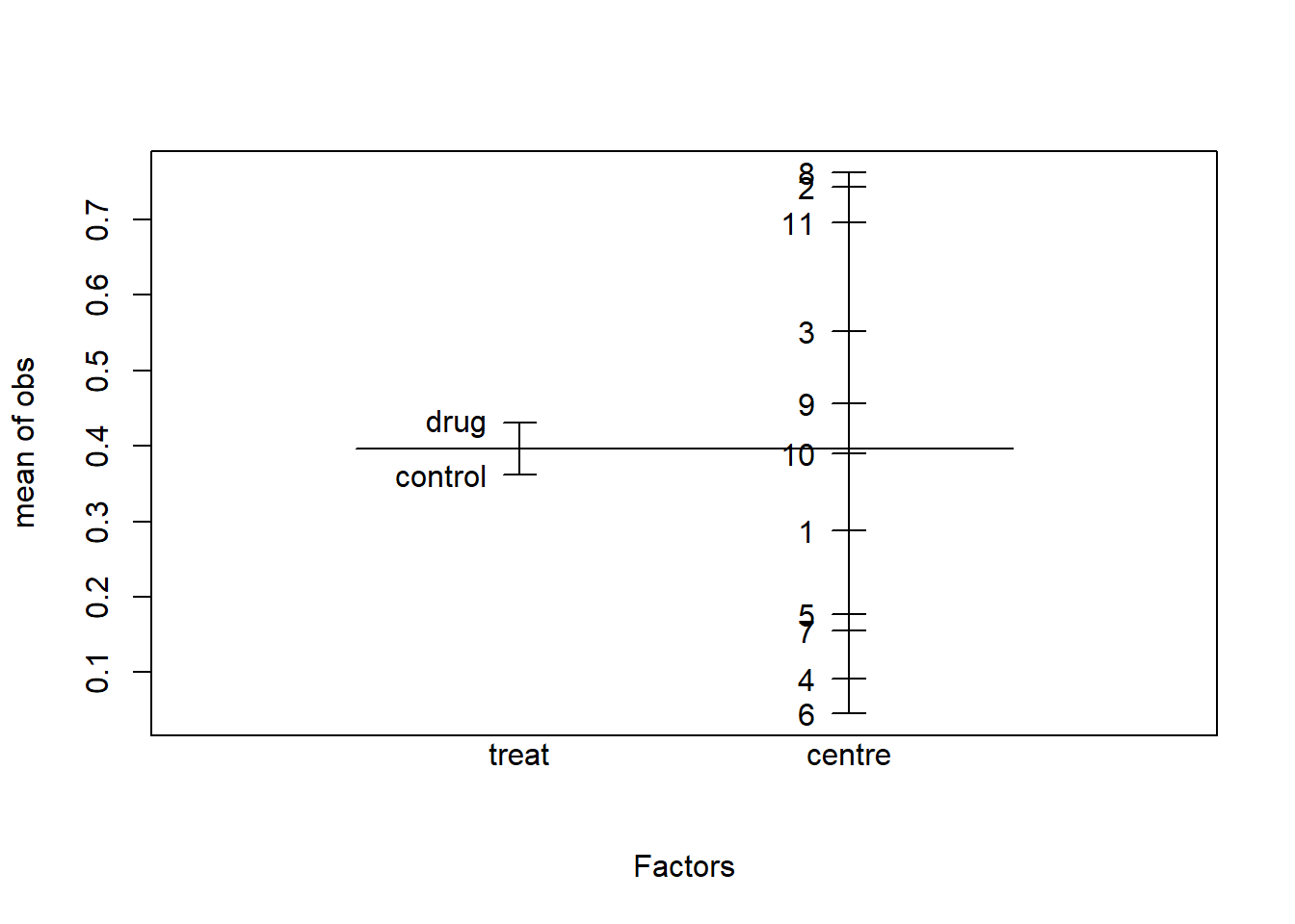
2. Which variable should be included as a fixed effect, and which as a random effect? Make a design plot to visually compare the magnitude of the effects of the centre and treat factors.
We want to compare these particular treatments (experimental factor), so we use fixed effects for the treat factor.
The eleven centres represents a random sample from the population about which we wish to make inferences (random factor), so we use random effects to model the center factor.
plot.design(obs ~ treat+centre, data=multicentre)
Average observed probabilities for each level of the factors treat and center
We see that the variability associated with the treatment is much lower than the variability associated with the centres.
We also see that the average probability of a positive response is higher in the active drug treatment.
3. Write the mixed logistic regression model equation.
\(\pi_{ij}\) is the probability of a favourable outcome in a patient on the \(i\)-th centre and \(j\)-th treatment
\(x_{ij}\) is an indicator variable for treatment (0=control, 1=active drug)
\(u_i\) is a random variable associated with the \(i\)-th centre
4. Test if random effects are necessary.
## Fit the models ##library(lme4)M0 <-glm(obs ~1+ treat, family="binomial", weights=n, data=multicentre)M1 <-glmer(obs ~1+ treat + (1|centre), family="binomial", weights=n, data=multicentre)## LRT for the variance component sigma2_u ##LRT <--2*(logLik(M0)-logLik(M1))mean(1-pchisq(LRT,df=c(0,1)))
[1] 3.885781e-15
## We can also use the AIC/BIC to compare the models ##data.frame(AIC=c(AIC(M0), AIC(M1)),BIC=c(BIC(M0), BIC(M1)),row.names=c("multicentre.glm","multicentre.glmer"))
We conclude that the treatment effect is not statistically significant.
6. Using the model with fixed and random effects, which is the probability of a positive response on the active drug group? Interpret \(e^{\beta_1}\) as an odds ratio and compute a 95% confidence interval.
For \(u_i=0\), the probability of a positive response over a population of centres under the active drug group (\(x_{ij}=1\)) is \(\hat{\pi}_{ij}=0.376\) with a 95% confidence interval of \([0.220, 0.564]\).
The estimated odds of a patient showing a positive response on the active drug group relative to the control group is 1.08 with a 95% confidence interval of \([0.77, 1.51]\). Since this CI contains 1, it is plausible that there are no differences in the odds between the drug and the control groups.
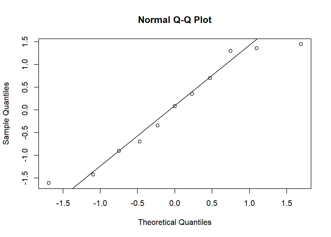
7. Using the best model, verify whether the model assumptions on the random effects are satisfied.
Model <- M1arand <-unlist(ranef(Model)$centre)qqnorm(rand)qqline(rand)
shapiro.test(rand)
    Shapiro-Wilk normality test

data:  rand
W = 0.93053, p-value = 0.4162
We don’t reject the null hypothesis of normality of the random effects.
8. Which is the estimated variance and 95% confidence interval of the within-centre random effect? Compute and interpret the intra-class correlation coefficient.
VarCorr(Model)
 Groups Name        Std.Dev.
 centre (Intercept) 1.1692
confint(Model, parm="theta_")
Computing profile confidence intervals ...
          2.5 %   97.5 %
.sig01 0.709846 2.060211
We can compute the intra-class correlation coefficient as \[\rho=\frac{\sigma^2_u}{\sigma^2_u+3.29}=1.169^2/(1.169^2+3.29) = 0.29347,\] which means that 29% of the overall variability can be attributed to the differences between centres.
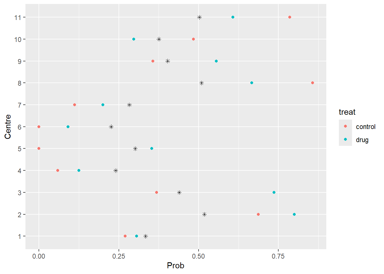
9. Compute the predicted probabilties of a positive response for each value of the dataset. Include those estimated probabilities in the descriptive plot of Section 1.
  centre   treat  y  n       obs      pred
1      1    drug 11 36 0.3055556 0.3337400
2      1 control 10 37 0.2702703 0.3337400
3      2    drug 16 20 0.8000000 0.5178894
4      2 control 22 32 0.6875000 0.5178894
5      3    drug 14 19 0.7368421 0.4391549
6      3 control  7 19 0.3684211 0.4391549
Observed (dots) and predicted (asterisks) probabilities of a positive response for each centre
Exercise 2
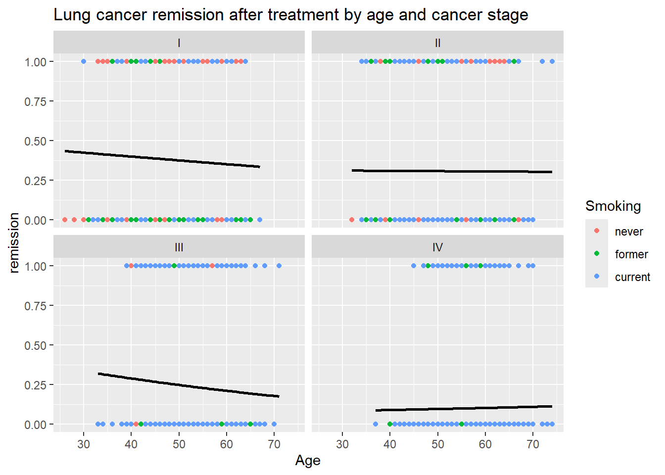
A Health Maintenance Organization wants to know what patient and physician factors are most related to whether a patient’s lung cancer goes into remission after treatment as part of a larger study of treatment outcomes and quality of life in patients with lung cancer.
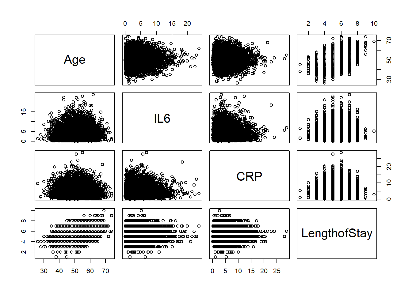
The data has a multilevel structure where 8525 patients are nested within 407 doctors, who are in turn nested within 35 hospitals. The dataset contains either individual-level, doctor-level and hospital-level explanatory variables:
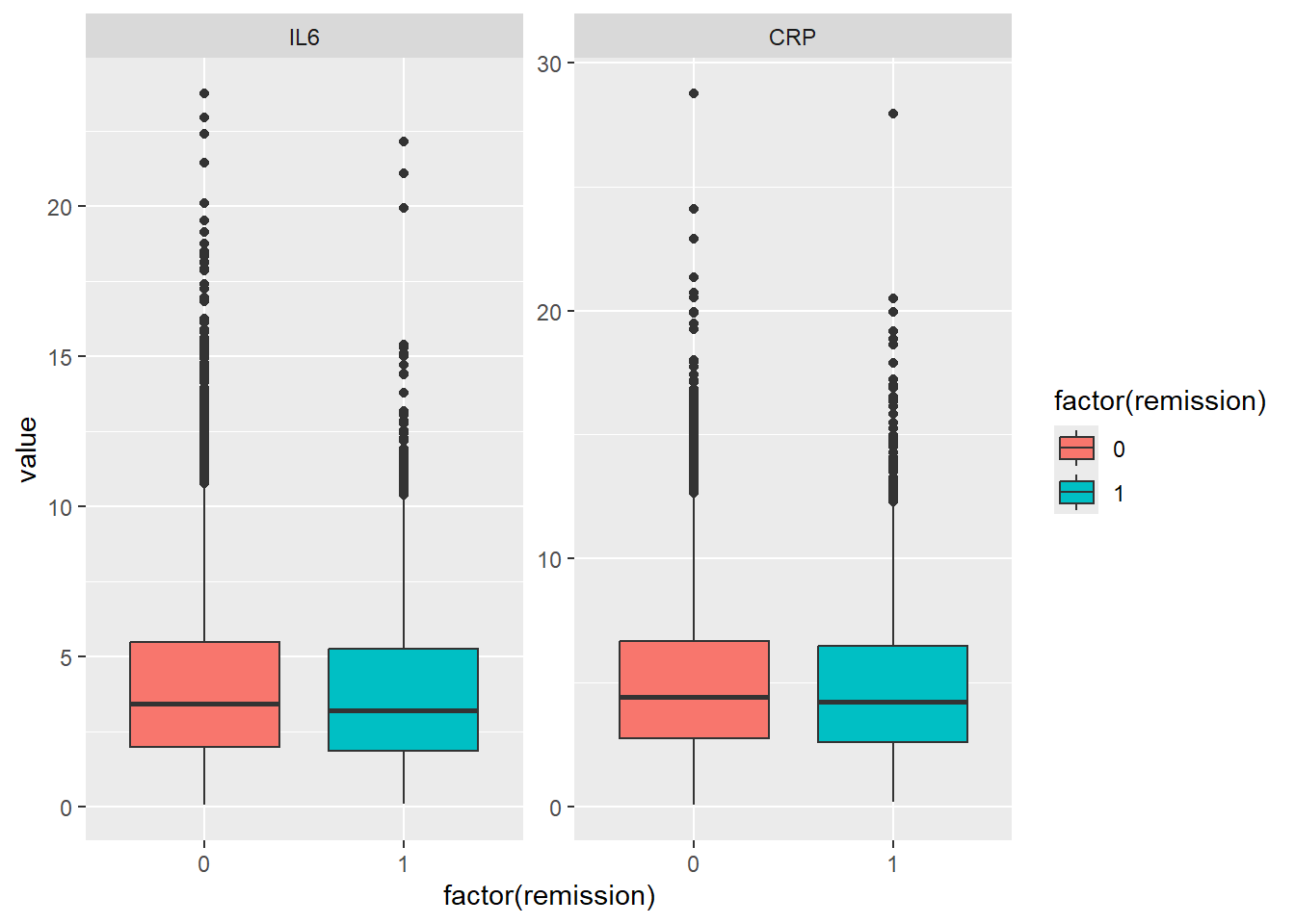
remission: response variable (0=no, 1=yes)
age: age of the patient (in years)
IL6: Interleukin-6 concentration in blood (pg/ml)
CRP: C-reactive protein concentration in blood (mg/dl)
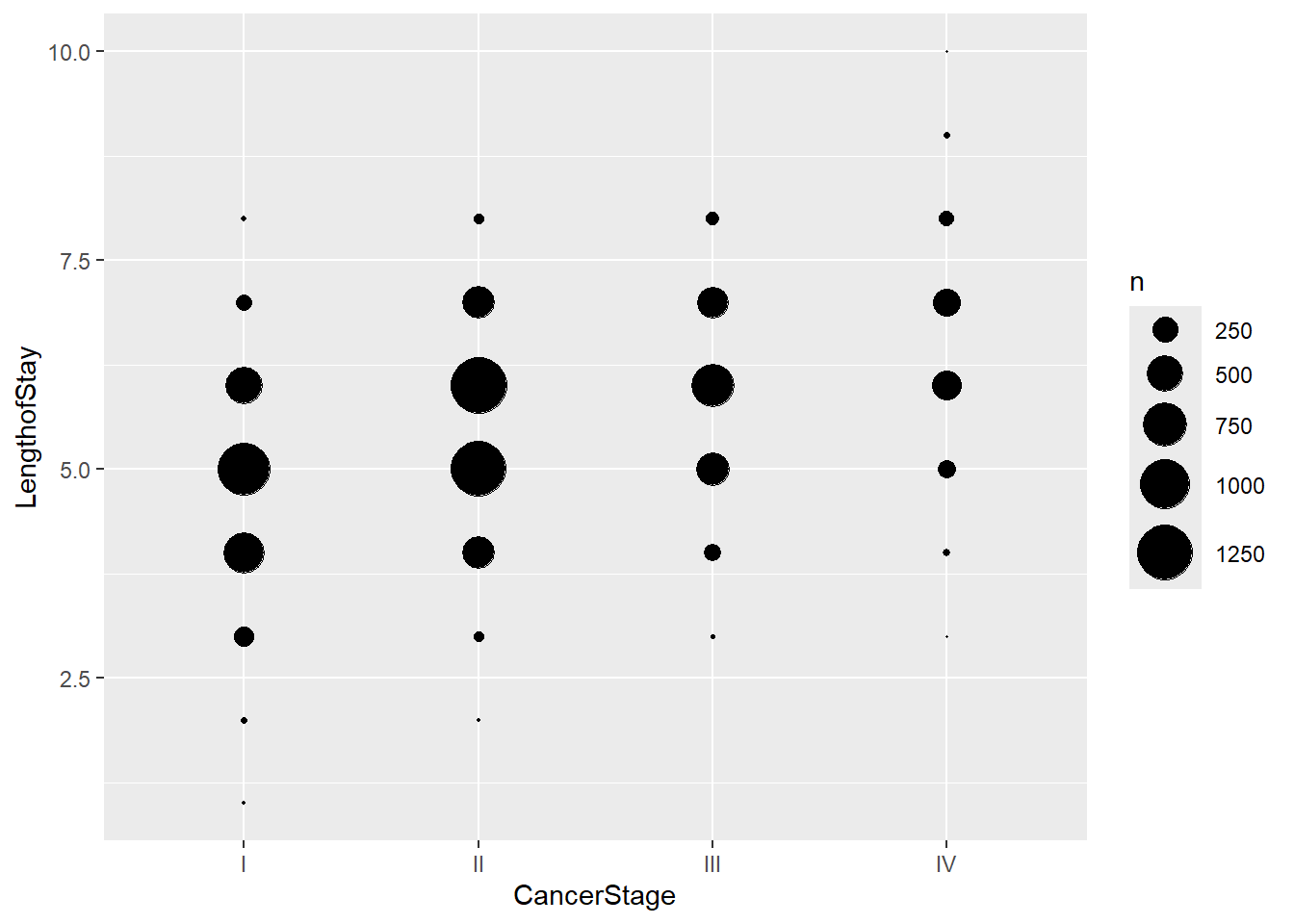
LengthofStay: duration of a patient’s hospital stay (in weeks)
CancerStage: lung cancer stage (I, II, III or IV)
Smoking: is the patient a smoker? (1=never, 2=former, 3=current)
ID.doctor: ID of the doctor
ID.hospital: ID of the hospital
1. Load the data intored in the patients.txt file. Convert ID.doctor and ID.hospital variables to factor.
ggplot(patients, aes(x=Age, y=remission, color=Smoking)) +geom_point() +stat_smooth(method="glm", color="black", se=FALSE,method.args =list(family=binomial)) +ggtitle("Lung cancer remission after treatment by age and cancer stage") +facet_wrap(~ CancerStage)
3. Test if random effects are necessary.
4. Hypothesis test for the fixed effects
5. Fit the final logistic mixed model and write its equation. Compute intra-class correlation coefficient(s).
6. Verify wether the model assumptions are satisfied
7. Examine the model results
8. Compute predicted probabilities of remission in lung for different patient characteristics attended by ID.doctor=2 in ID.hospital=1.
Exercise 3
The MotorIns dataset contains motor insurance data from Swedish insurance companies for the year 1977. The objective is to examine how different risk factors influence the number of insurance claims using a generalized linear mixed model (GLMM) with a Poisson distribution and a log link.
Each observation represents a homogeneous group of policyholders sharing the same risk characteristics, rather than an individual policyholder. For each group, the dataset records the total exposure (measured in policy-years) and the total number of claims.
Available variables:
Claims: total number of claims
Insured: exposure to risk (measured in policy-years)
Km: ordinal factor indicating the annual mileage of the vehicle:
1=“less than 1.000km”
2=“1.000-15.000 km”
3=“15.000-20.000 km”
4=“20.000-25.000 km”
5=“more than 25.000 km”
Bonus: number of years (plus one) since the last claim.
Zone: geographical area of the policyholder.
1. Load the data intored in the MotorIns.txt file. Convert Km to factor and define the claims per-policy-year variable.
2. Make some descriptive plots to visualize the relationship between variables
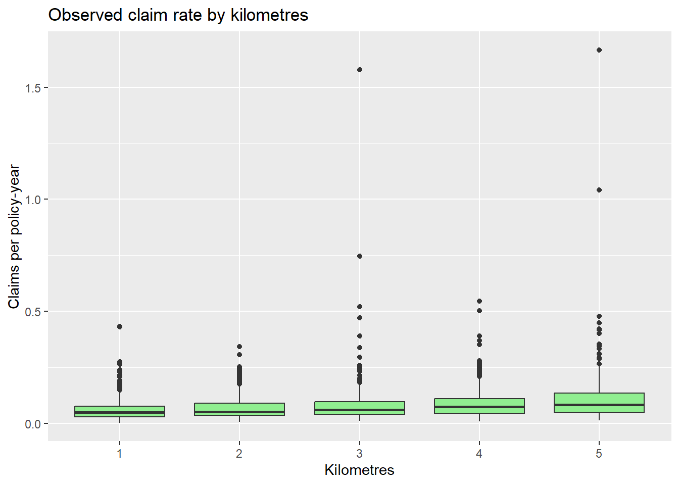
ggplot(MotorIns, aes(x = Km, y = rate)) +geom_boxplot(fill ="lightgreen") +labs(title ="Observed claim rate by kilometres",y ="Claims per policy-year",x ="Kilometres")
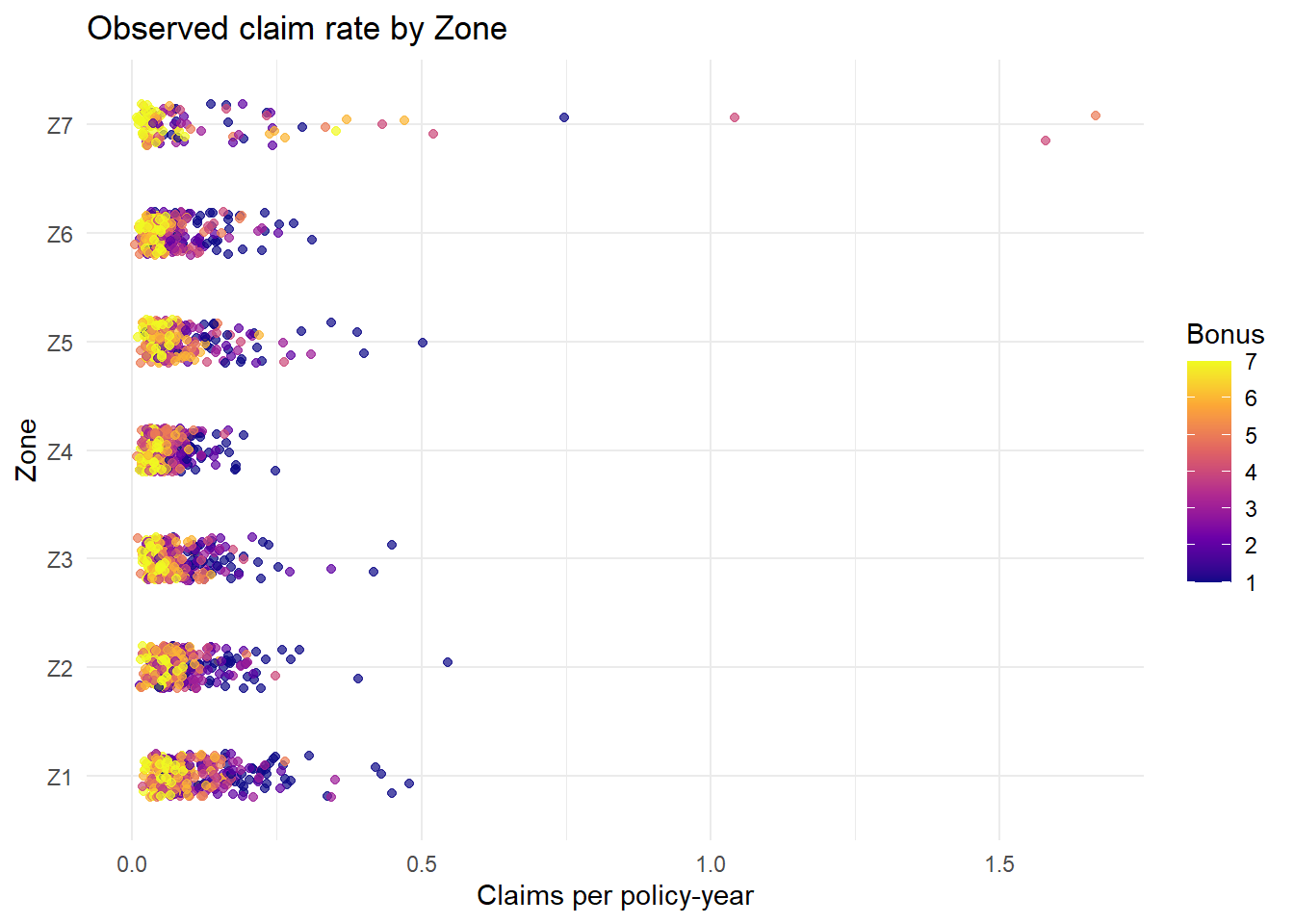
ggplot(MotorIns, aes(x = rate, y = Zone, color = Bonus)) +geom_jitter(height =0.2, alpha =0.7) +# dispersa los puntos verticalmentescale_color_viridis_c(option ="plasma") +# escala de colores continualabs(title ="Observed claim rate by Zone",x ="Claims per policy-year",y ="Zone",color ="Bonus" ) +theme_minimal()
3. Test if random effects are necessary.
4. Hypothesis test for the fixed effects
5. Write the equation of the final Poisson mixed model and check its assumptions
6. Examine the model results
7. Compute the predicted number of claims for vehicles 4 years of bonus with different characteristics, assuming an exposure of 1,000 insured policy-years.